Analysis
batting2 = filter(batting, batting$yearID > 1961) %>% select(yearID,H,X2B,X3B,HR,AB,BB,HBP,SF) %>% na.omit() %>% mutate(TB = H+2*X2B+(3*X3B)+(4*HR)) %>% mutate(SLG = TB/AB) %>% na.omit() %>% mutate(OBP = (H + BB + HBP)/(AB + BB + SF + HBP)) %>% mutate(OPS = SLG + OBP) %>% mutate(steroidEra = (yearID>1983 & yearID<2003)) %>% filter(AB>160)Using the filter function from the “dplyr” package, we took our batting data and truncated it below at the year 1961, since this is the year that baseball had become today’s standard of 162 games. Then using the select function we picked our desired variables, and then omitted any missing values(Na’s). Lastly we used mutate to create a series of new variables which ended up producing OPS, as such
\[TB=H+2(X2B)+3(X3B)+4(HR)\] \[ SLG=TB/AB \] \[OBP=(H+BB+HBP)/(AB +BB+SF+HBP) \] \[OPS=SLG+OBP \]
table = batting2 %>% group_by(yearID,steroidEra) %>% summarise(avgOPS = mean(OPS))Next, creating a table with variables denotating: specific year, specifying if year is in steroid era (or not), and average OPS.
ggplot(batting2, aes(x =yearID, y = OPS)) + geom_point(aes(x =yearID, y = OPS ,col=steroidEra)) + geom_smooth(se=FALSE) + ggtitle("Average OPS Over Time") + xlab("Year") + ylab("OPS") + scale_color_discrete(name='Steroid Era') + theme_minimal() + scale_color_manual(name= "Era",labels=c("Non-Steroid Era","Steroid Era"),values = c("green","red")) + theme_bw() 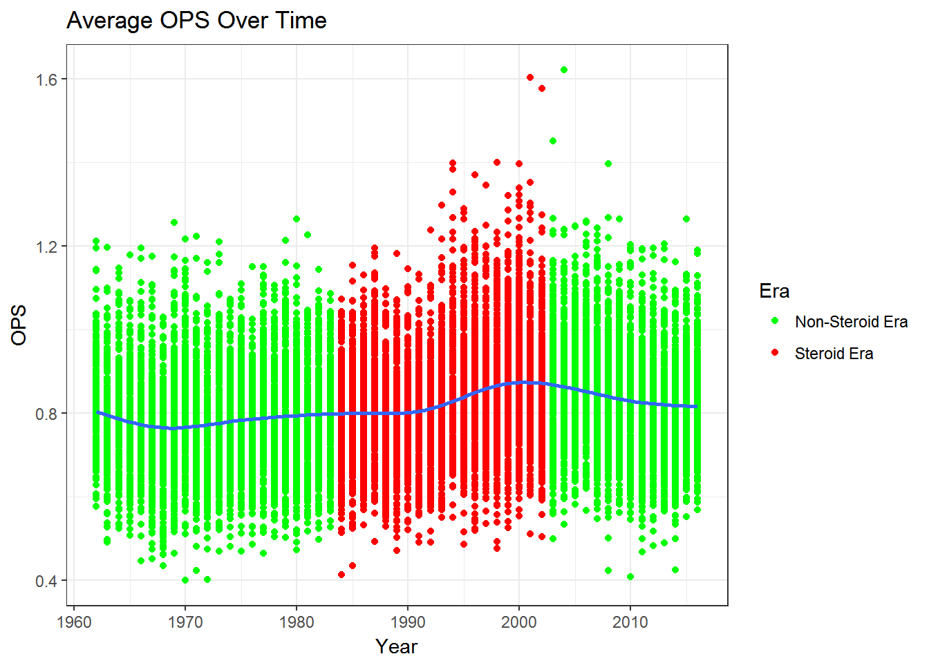
ggplot(table, aes(x =yearID, y = avgOPS)) + geom_point(aes(x =yearID, y = avgOPS ,col=steroidEra)) + geom_smooth(se=FALSE) + ggtitle("Average OPS Over Time") + xlab("Year") + ylab("Average OPS") + scale_color_manual(name= "Era",labels=c("Non-Steroid Era","Steroid Era"),values = c("green","red")) + theme_bw() 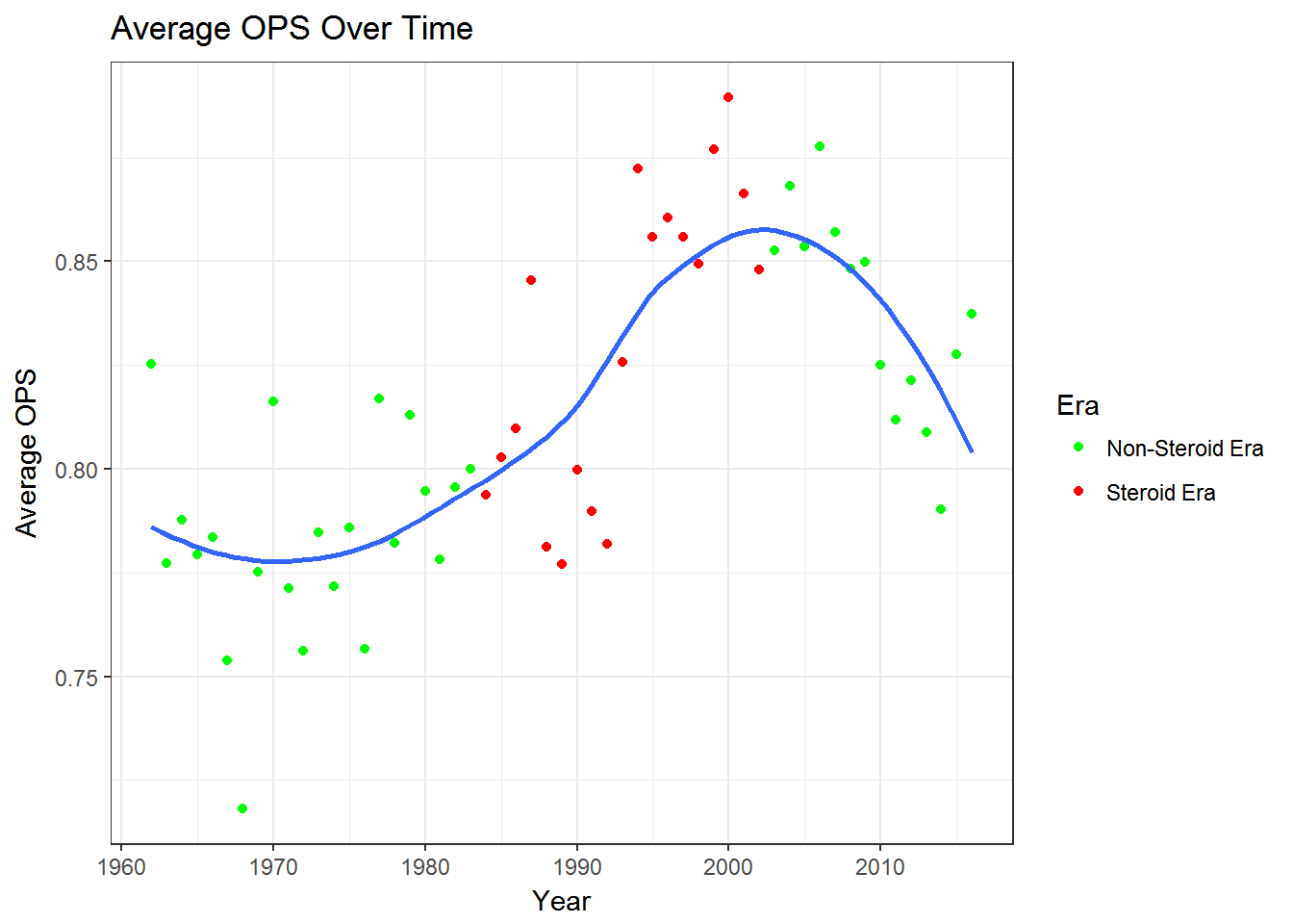
We can see that average OPS increases steadily during the 60’s and 70’s, increasing moderately still through 80’s, plateu around 2000, then decreases steadily after.
pitching2 = filter(pitching, pitching$yearID > 1961)%>%
  select(yearID,ERA,G) %>% na.omit %>%
  mutate(steroidEra = (yearID>1983 & yearID<2003)) %>% filter(G>15)

table2 = pitching2 %>% group_by(yearID,steroidEra) %>% summarise(avgERA = mean(ERA))
Using filter function on the pitching data to get years from 1961 to current. Then selecting years and ERA, and omitting Na’s. Then using mutate to specific steroid era as years 1983-2003.
ggplot(pitching2, aes(x =yearID, y = ERA)) + geom_point(aes(col = steroidEra)) + geom_smooth(se=TRUE) + ggtitle("Average ERA Over Time") + xlab("Year") + ylab("Average ERA") + scale_color_discrete(name='Steroid Era') + theme_minimal() + scale_color_manual(name= "Era",labels=c("Non-Steroid Era","Steroid Era"),values = c("green","red")) + theme_bw() 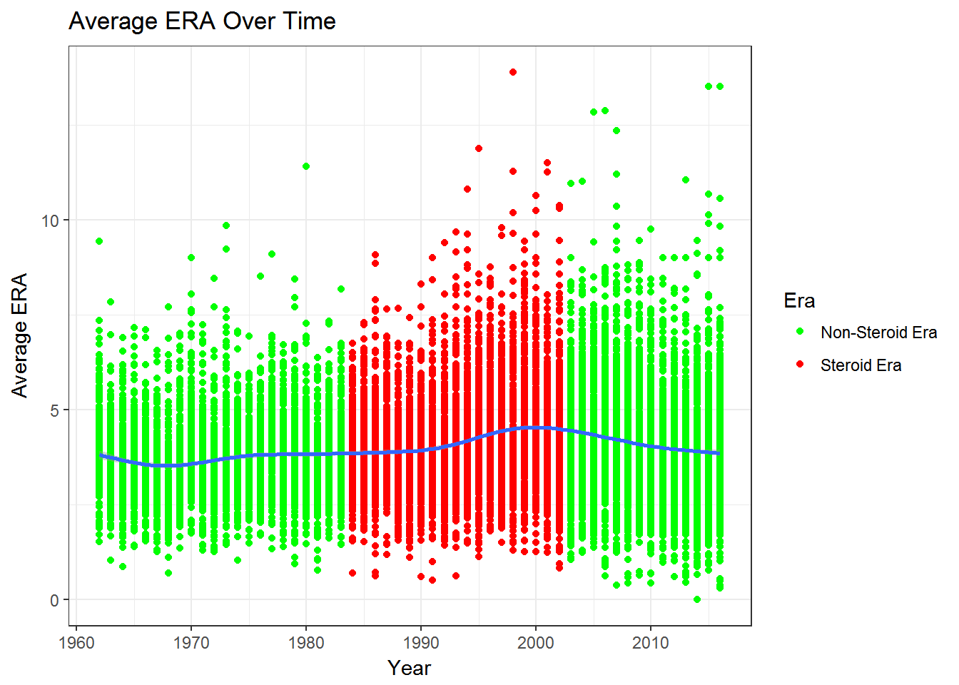
ggplot(table2, aes(x =yearID, y = avgERA)) + geom_point(aes(col = steroidEra)) + geom_smooth(se=FALSE) + ggtitle("Average ERA Over Time") + xlab("Year") + ylab("Average ERA") + scale_color_discrete(name='Steroid Era') + scale_color_manual(name= "Era",labels=c("Non-Steroid Era","Steroid Era"),values = c("green","red")) + theme_bw() 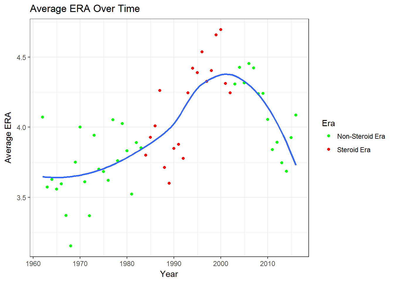
Again, creating a table but with variables denoting: specific year, specifying if year is in steroid era (or not), and average ERA.
We can see that average ERA decreases until the 1980’s, then increases drasticly up till the early 2000’s, then begins a steady decrease.
Drawing Conclusions:
From the 60’s up till the steroid era, we see an increase in average OPS and decrease in average ERA, signifying that preformance was increasing for both pitchers and hitters.
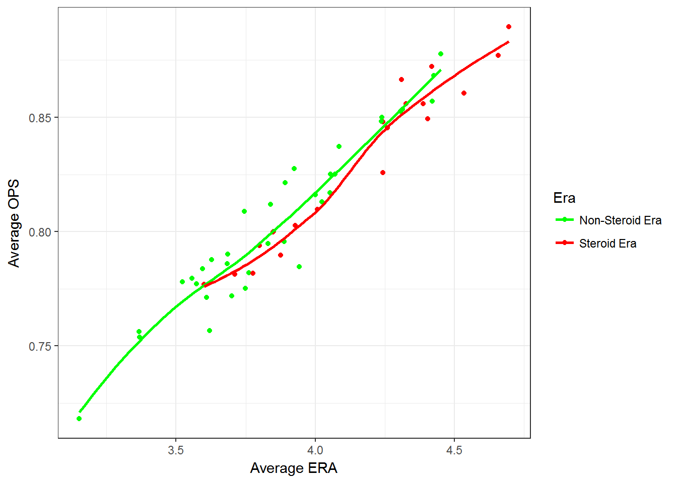
During the steriod era, ERA increase when OPS did, and then both begin to decrease around the end of the steriod era.
It appears that steriods did give an advantage to batters over pithers during the steroid era.
opsera = left_join(table,table2, by='yearID')
ggplot(opsera, aes(avgERA,avgOPS,col = steroidEra.x)) + geom_point() + geom_smooth(se=FALSE) +  scale_color_manual(name= "Era",labels=c("Non-Steroid Era","Steroid Era"),values = c("green","red")) + theme_bw() + xlab("Average ERA") + ylab("Average OPS")